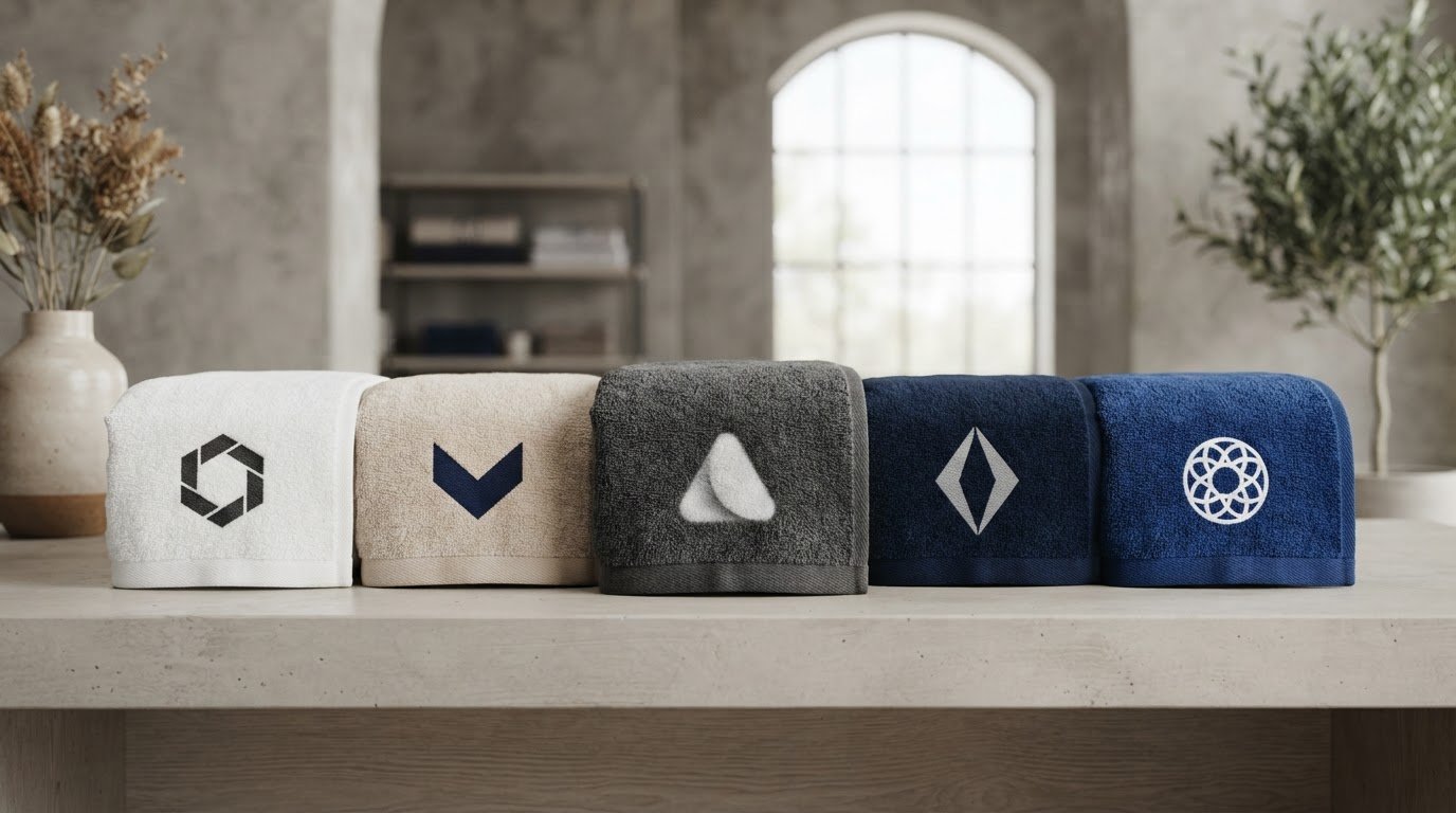
The darkest towel isn’t automatically the best backdrop for your logo. If you’re asking what color towel shows logos best, start with contrast: a light logo can stand out on a dark towel, while darker artwork often reads clearly on a light one. The right pairing also depends on the towel’s material, the print method, and the detail in your design. A logo can lose visibility if its colors blend into the fabric or its fine lines disappear against the towel’s texture.
This guide explains how to compare towel and logo colors for your intended use. You’ll learn how screen printing, dye sublimation, and towel materials can affect the result, and why bold shapes and legible details matter. You’ll also find practical ways to prepare light and dark logo versions and questions to ask when discussing a wholesale custom towel order.
Key Takeaways
- What color towel shows logos best depends on your logo’s dominant colors, the towel background, and how the design will be printed.
- Consider how fabric texture and print method may affect the logo’s appearance, then confirm the options for your chosen towel.
- Compare light and dark towel-and-logo combinations to spot potential blending before you finalize the design.
- Plan around the event setting, audience, and viewing distance so the logo is easy to recognize where it will be used.
- Share your artwork and intended use when discussing wholesale custom towels, and review a proof before approving the design.
What Towel Color Shows a Logo Best? Start With Contrast
The towel color that shows a logo best creates a clear visual difference between the fabric and the logo’s main colors. There is no single best shade for every brand. A white towel may make a dark logo easy to see, while a navy towel could give a light logo more impact. The right choice depends on your artwork and the specific towel color you’re considering.
Contrast is the visible difference between two elements, such as a logo and the fabric behind it. The concept of Contrast (vision) helps explain why distinct light and dark values are easier to tell apart. Color names alone don’t tell the whole story. Two colors can have different hues, such as blue and red, but similar brightness, making them harder to distinguish from a distance.
Check the logo against the actual towel color before approving the artwork. Don’t rely only on a screen preview or a color name. Review the pairing at the size the logo will appear, and consider where people will see the towel. A design for a busy event may need to read quickly from farther away. A giveaway people will handle up close may allow for more detail.
How light and dark backgrounds change logo visibility
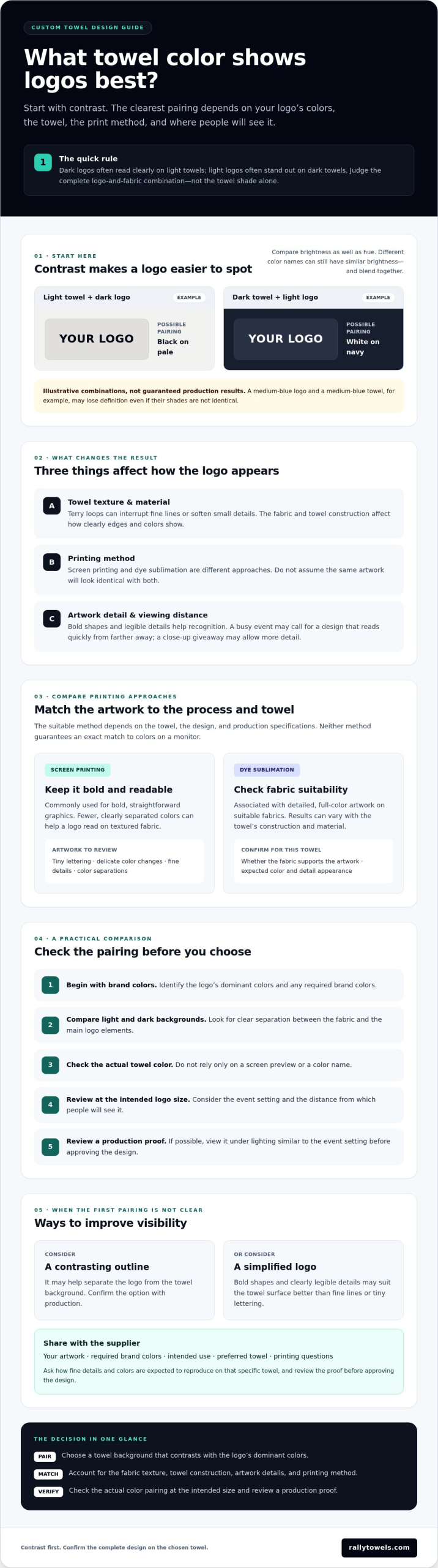
Dark logos often stand out on light backgrounds, and light logos often stand out on dark backgrounds. For example, a hypothetical black logo on a pale towel may be easier to distinguish than the same logo on charcoal fabric. A hypothetical white mark on navy may read more clearly than white on light gray. These are design examples, not guaranteed production results. Compare brightness as well as hue: a medium-blue logo and medium-blue towel could lose definition even if their shades aren’t identical.
When brand colors limit your towel choice
Start with your organization’s required brand colors, then look for a towel background that keeps the main logo elements visible. If the preferred combination has weak contrast, ask whether a contrasting outline or a simplified logo could help. Either option needs production review because the towel and printing method can affect the result. Before approval, review a proof against the intended towel color and, if possible, under lighting similar to the event setting. This can reveal colors or small details that are harder to see than they looked on screen.
To decide what color towel shows logos best, judge the full combination, not the towel shade by itself. Share your artwork, required brand colors, and intended use when discussing a wholesale custom towel order. Confirm the final design with the supplier before production so the color choice supports a logo people can recognize.
How Towel Material and Printing Method Affect Logo Color
A color pairing that looks crisp in a digital file can appear different once it’s printed on fabric. Towel texture, the material, and the printing method all influence how clearly logo edges and colors show. Terry loops, for example, can interrupt fine lines or soften small details. Choose artwork that suits the towel’s surface, then confirm how that specific combination will be produced.
Screen printing and dye sublimation are different approaches, so don’t assume a design will look identical with both. Screen printing is commonly used for bold, straightforward graphics, while dye sublimation is associated with detailed, full-color artwork on suitable fabrics. The right choice depends on the towel, design, and production specifications. Neither method guarantees an exact match to colors on your monitor.
Screen printing: plan for simple, readable artwork
Fewer, clearly separated colors can make a screen-printed logo easier to read, especially on a textured towel. A bold wordmark or simple symbol may hold up better than tiny lettering or delicate color changes. Fabric, artwork, and production specifications all affect the result, so ask the supplier how fine details and color separations are expected to reproduce. Confirm any design limits before approving the artwork.
Dye sublimation: consider the design and towel construction
Dye sublimation is a distinct printing method, but the result can vary with the towel construction and material. Confirm that the selected fabric supports your intended artwork, and ask how the design’s colors and details are expected to appear on that particular towel. For method and product information, see dye-sublimated towels. Review the production proof rather than relying on a screen preview alone.
So, what color towel shows logos best when the print method is part of the decision? Choose a pairing that maintains clear separation between logo and background, then check that the chosen process and fabric can reproduce the artwork legibly. Share your logo file, brand color requirements, and intended use when asking for supplier guidance. Rally Towels offers wholesale rally, beach, cooling, wedding, and dye-sublimated towels, so you can discuss the intended design alongside the towel category. Explore custom towel options.
Light vs. Dark Towels: Compare Logo Combinations Before You Choose
Light and dark towels can both work as logo backgrounds, but neither guarantees a clear result. A popular neutral shade won’t automatically make every design easier to see. The logo’s brightness, color, outline, and level of detail all matter. Use the comparison below to identify combinations worth reviewing, then confirm how the specific towel and print method will reproduce them.
| Background | Likely contrast benefit | Design caution |
|---|---|---|
| Light towel | Dark or saturated artwork may stand out clearly. | Pale logo elements can disappear against a similarly light background. |
| Dark towel | Light or bright artwork may be easier to pick out. | Dark logo details can merge with the fabric and lose definition. |
| Mid-tone towel | A very light or very dark logo may create useful separation. | Mid-tone artwork may lack enough difference in brightness. |
Judge the complete logo-and-towel combination, not either color alone. If you’re asking what color towel shows logos best, compare the logo’s main colors against the actual background instead of choosing a towel based only on popularity or preference.
When a light towel is the stronger choice
A light background can be a good candidate for dark or saturated artwork. For example, a hypothetical deep-green logo on a light-gray towel may have clearer separation than the same logo on a dark-green towel. But pale logo areas, thin outlines, and small details may fade into white, cream, or another light background. Review the artwork at the size people will see it, from a realistic viewing distance and under event lighting.
When a dark towel is the stronger choice
A dark background may suit light or bright artwork, such as a hypothetical white symbol on a deep-burgundy towel. Confirm the print method and towel options with the supplier before settling on that pairing. Dark logo elements can vanish against dark fabric, especially when the design uses subtle shading or narrow lines. Ask the supplier to review whether an outline, more negative space, or a simplified mark could improve separation.
Compare more than one version if your brand artwork includes both light and dark elements. A proof can help reveal whether the complete design remains readable against the intended towel color. Check it at the intended logo size and in lighting similar to the event, then ask the supplier about details that look crowded or difficult to distinguish. That review helps you make an informed choice before approving the design.
A Practical Checklist for Choosing Towel and Logo Colors
A clear plan makes it easier to choose a towel color, prepare the artwork, and review the design before approval. Work through these steps before finalizing a wholesale promotional towel order. If you’re planning towels for a game or event giveaway, explore the custom rally towel options as you consider the use and design.
- Start with your brand requirements. Gather the approved logo artwork and any required brand-color references. Note which colors must stay consistent and whether you have alternate light or dark logo versions.
- Describe the use. Identify whether the towels are for a stadium, team, beach, wedding, or promotional event. Consider the audience, setting, and expected viewing distance. A logo meant to catch attention across a venue may need a simpler, bolder treatment than one people will examine up close.
- Choose a suitable towel and printing approach. Share your preferred towel type and ask which colors and printing options are available for it. Confirm any fabric or process limitations that could affect the artwork.
- Check the design as a whole. Review logo-to-background contrast, logo scale, small details, and text legibility together. Look for elements that may blend into the towel or become difficult to recognize at the intended size.
- Review the supplier proof before approval. Compare the proof with the selected towel background, not only with a white screen. Ask the supplier to clarify any color, fabric, or process questions before approving the design.
Prepare your logo and intended use
Send the correct artwork file and brand-color information, then explain where the towel will be used and how people are likely to see it. Include practical context, such as an outdoor beach event, a wedding, or a crowded stadium. This helps the supplier assess whether the proposed design and towel choice fit the setting.
Review the proof before approving the order
Zooming in on a screen can make fine details seem clearer than they’ll look on a towel. Check small text and narrow marks at a realistic size, and consider the viewing distance and event lighting. Ask the supplier to confirm how the artwork is expected to reproduce on the selected towel before giving final approval.
Use this process to answer what color towel shows logos best for your specific design and event, rather than relying on a color trend or screen preview. For help planning a custom towel order, share your artwork and intended use with Rally Towels.
Make Your Custom Towel Logo Stand Out With the Right Design Choices
A strong custom towel design starts with clear contrast, but the color decision isn’t complete until you’ve checked the logo on the chosen towel and confirmed that the printing method suits it. There’s no universal answer to what color towel shows logos best. The best match depends on your artwork, towel format, and where people will see it.
Match the towel format to the event
Think about the setting before settling on a design. Rally towels suit game-day and event use, while beach towels are intended for beach settings. The format affects how the design will be presented and viewed, so consider the towel and artwork together from the start. For event applications, review custom rally towels as part of your planning.
Turn a color decision into a production-ready design
Give the supplier the context needed to assess your artwork. Share the logo, preferred towel color, and intended setting, such as a game, team event, beach gathering, or promotional program. Include the selected towel type and printing preference if you have one. These details help the supplier review how the design may work with the towel and production approach.
Before approving final artwork, ask the supplier to confirm which towel-color options are available and whether the proposed fabric and printing method suit your design. Don’t assume a screen preview guarantees an exact color match or that every detail will reproduce the same way on every towel. Ask about elements that may need adjustment, then review the proof against the intended towel color.
Rally Towels offers wholesale custom rally, beach, cooling, wedding, and dye-sublimated towels for teams, events, and promotional programs. Share your intended use and artwork to discuss the towel and logo together, then review the production proof before approving the design.
Choose a Towel and Logo Combination That Gets Noticed
The answer to “what color towel shows logos best” starts with contrast, but the towel shade alone doesn’t determine whether a logo will stand out. Consider the artwork’s light and dark elements, the towel material, and the printing method together. Then review the proof against the intended towel color and check that the logo remains legible at its expected viewing distance.
Rally Towels produces wholesale custom towels for organizations ranging from athletic booster clubs to major sports leagues and Fortune 500 companies. Its offerings include custom rally towels and dye-sublimated towels. Share your intended use, logo artwork, and preferred towel color to discuss the production details, and confirm available options before approving the final design.
Ready to plan your custom towel order? Contact Rally Towels to plan a custom towel order. Start by sharing your artwork and intended use, then review the towel and logo combination before approving the design.
Frequently Asked Questions
What color towel makes a logo stand out the most?
The towel color that creates the clearest contrast with the logo’s main colors will usually make it stand out best. That means what color towel shows logos best depends on the artwork, not on one universally effective shade. A dark logo may read clearly on a light background, while a light logo may show up better on a dark one. Check the full combination on a proof before approving it.
Do logos show up better on light or dark towels?
Neither light nor dark towels are always better. Dark artwork often stands out on a light towel, while light artwork may be easier to see on a dark towel. Look at brightness as well as hue: a blue logo and red towel might still blend if they have similar lightness. Consider the logo’s smallest details and intended viewing distance, then review the design against the actual towel color.
What logo color works best on a black towel?
Light or bright logo colors can create strong contrast against black, but the best choice depends on your brand palette and the printing method. White, pale gray, or a vivid brand color may be worth reviewing as options, not guaranteed results. Dark details in a multicolor logo can disappear against black. Ask the supplier to check the complete design, including outlines and small text, on a proof.
Can you print a white logo on a colored towel?
A white logo may work on a colored towel if the selected towel and printing process support the design. Don’t assume white will reproduce the same way across every material or method. Ask the supplier to confirm whether white artwork is suitable for your chosen towel, how it may appear against that background, and whether any adjustments are needed. Review a proof before approving the final artwork.
How do I make a logo easier to read on a towel?
Use clear contrast, bold shapes, and lettering that remains readable at the logo’s intended size. Simplify fine details or small text if they become hard to distinguish on the towel’s surface. Check the artwork at a realistic viewing distance, especially if the towel will be seen across a stadium or event space. A proof can help you assess the design on the background before you approve it.
Does towel material affect how a logo looks?
Yes. The towel’s material and surface can affect how logo edges, fine marks, and colors appear. A textured surface may make intricate details less distinct, and different printing methods suit different towel constructions. For example, dye sublimation requires a suitable fabric, so confirm compatibility rather than assuming every towel will produce the same result. Ask the supplier to review the artwork against your selected towel and intended printing method.
Should I choose the towel color before designing the logo?
Plan the towel color and logo together. If your organization has required brand colors, use those as a starting point, then compare them with towel backgrounds that may be available. If the pairing lacks contrast, consider an alternate logo version or a simplified design, subject to supplier review. Confirm the towel and printing options before finalizing the artwork, then check a proof against the intended background.